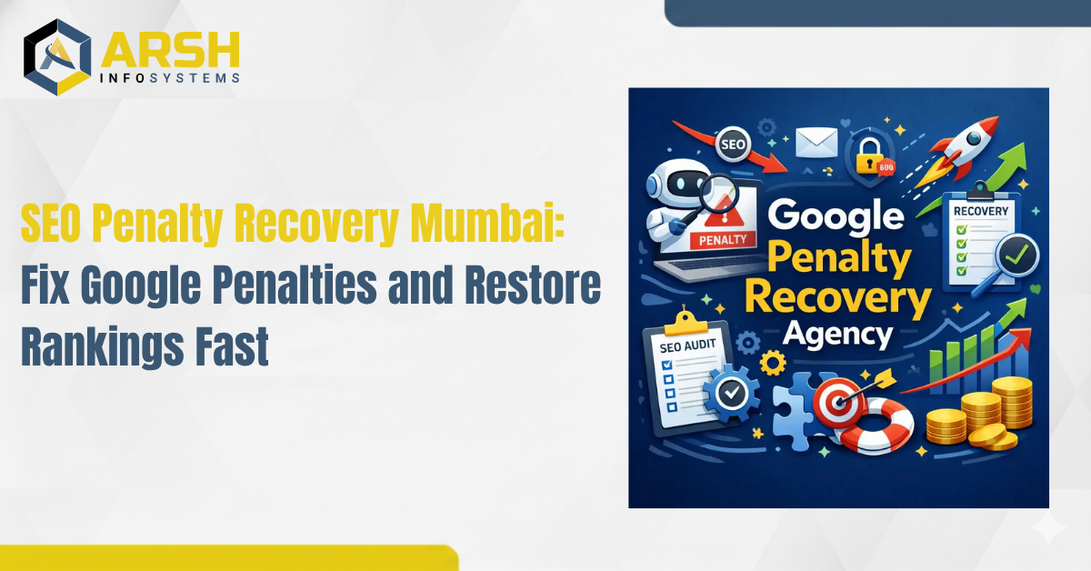
Komal Saim March 05, 2026

Komal Saim March 05, 2026

Mobile-first indexing is a significant component of SEO. This means that Google does search result crawling, indexing and ranking of the search results, but the main content that Google uses is the mobile version of the content of a particular site. This was altered by the fact that most internet users can now view the sites on their mobile phones through smartphones and tablet gadget and Google has been experimenting with the appearance of websites for consumers using mobile phones. Unless the website optimises to operate on mobile devices, it will negatively affect the ranking of searches and reduce the exposure of the website to the search results page.
It has been observed that mobile optimisation is not an option anymore for businesses that wish to boost their appearance on the internet. Mobile-friendly site is quick in response and easy to load, making iuser-friendlyly and effective in improving the search rank. Google crawler is also examined on the mobile version in terms of content, performance, and usability to provide it with a position on ranking when crawling a site. This means that you will still have a great desktop experience, but a poor mobile experience will still influence your search engine performance.
A professional SEO company in Mumbai can be one of the ways through which it is ensured that businesses can react to these changes. As a competent SEO firm, they will be in a position to optimise your site for mobile clients, enhance technical SEO, improve the performance of the page, as well as ensuring that your content is ranked high in the mobile-first indexing. With the right mobile SEO strategies, the companies would be capable of increasing their presence in the search engine, achieving higher mobile traffic and staying competitive within the digital realm at present.

Mobile-first indexing is described as the approach adopted by search engines, especially Google, that crawls, indexes and ranks the mobile version of a web page in search results. Previously, Google used to test the desktop site version and regarded the mobile version as secondary. Google, however, altered its strategy once mobile browsing became the most popular mode of accessing the internet and when ranking the search results began to give more consideration to mobile content.
This trend is indicative of the new generation of user behavior where most of the online search is done via smartphones and tablets. For this reason, Google desires to make sure that the user obtains optimised mobile device results. When a website is not built to be mobile screen-friendly, e.g., with slow loading speed, bad navigation, unreadable text, etc., it might not perform well in the search engines. In other words, good SEO performance is now impossible without a good mobile experience.
Mobile-first indexing also puts emphasis on providing a user-friendly and smooth experience to all gadgets. Those websites that are mobile-optimised have more chances to gain greater visibility, more engagement and higher search positions. Conversely, sites that do not consider mobile usability can be ranked lower and get lower organic traffic.
Mobile optimisation is not an option anymore; it is a must in the modern digital world. The use of responsive design, increased page loading speed, and mobile-friendly content structure can be used to ensure that your site is up to date in terms of SEO. With the move by search engines towards mobile-first indexing, companies have to adjust their strategies to emphasise mobile performance so as to stay competitive as well as ensure long-term online visibility.

Mobile-first indexing has also given heavy priority to the provision of a better user experience, particularly to mobile users. With most internet users currently accessing the sites using smartphones and tablets, it is but natural that businesses should make sure that their websites can run smoothly using mobile applications. The ease of navigation, visual clarity, and speed of loading give a visitor a good experience on a site. When users find what they are looking for without being frustrated, then they are more likely to be willing to remain on the site and get in touch with the material.
Responsive design provides that a website will automatically adapt its layout and images, as well as the content, to suit various screen sizes of the screens. The site is also easy to read and navigate, regardless of whether the user is on a smartphone, tablet or desktop. This flexibility enhances usability and makes visitors get the same experience whether using one device or the other. A responsive site also makes the search engines comprehend that your site is mobile-friendly, thus enhancing SEO performance.
The other important factor that has a direct impact on user experience and search result positions is the speed of loading a site. Mobile customers demand websites that can be loaded fast, and even a couple of seconds can make the visitors abandon the site. The process of optimisation of site speed may involve compressing images, reducing the number of needless codes, enhancing the performance of the server, and enabling a browser to cache. Not only will faster websites keep the users busy, but they also send an indication to the search engines that the site is a good place to
An optimised mobile-friendly site can be of significant help in boosting user engagement with the site and the conversion rates. Visitors can easily navigate, find out the pages and access the information within the site, then they will be likely to browse more pages and perform the necessary actions like filling a form, purchasing a good or service and calling the business. With mobile-first indexing, mobile usability is the key to a business establishing a stronger customer engagement and improved digital marketing performance.

The mobile-first indexing has been transformed tremendously regarding the way search engines access and rank websites. The mobile optimisation is now a more significant feature of the SEO performance as Google has begun to index and rank the mobile version of a website. Easy and effective mobile websites stand better prospects of acquiring better rankings, and websites with low mobile usability stand to lose their search position.
In mobile-first indexing, Google relies mainly on the mobile version of a specific site in ranking the site in the search results. The reason is that a site may be performing well on the desktop site, but a poorly optimised site on the mobile platform may be a liability to the positioning of the site. Sites that load slowly, which do not work well on a small screen or the experience of navigating through is an uphill task, may fail to secure good positions in search engines. The mobile friendliness in site is thus one of the major ways of making sure that your site is visible and promoted in search engines.
Mobile-first indexing is crucial due to the importance of content optimization of mobile devices. The websites need to be designed in a responsive manner that ensures that the content will automatically adjust to the different screen sizes. The text should not be required to be zoomed in order to read it, the images should be scaled, and the buttons or any other elements of the navigation should be convenient to tap. Moreover, you should make sure that the mobile and desktop versions have the same content so that the search engines are able to interpret and add the information to your site in the right way.
By making your whole website more mobile-friendly, you can improve your performance in search. The best practices include optimisation of page speed, compression of images, reduction of unnecessary scripts, as well as unnecessary intrusive pop-ups that disrupt the user experience. Convenient navigation, simple designs and fast loading pages are some of the features that can retain the users to be interested and enable them to read further on your website. Search engines would score higher websites that provide a better user experience and a better ranking.
The structured data, also known as schema markup, helps the search engines in gaining a better understanding of what is on your site and its context. When correctly marked up (both in the mobile and desktop versions of your site), structured data may improve your on-page presentation in search results in the shape of rich snippets and enriched listings. Mobile-first indexing is a more promising opportunity to display the presence of your site and increase its chances of receiving organic traffic due to the demonstration of clear and organised information.

Responsive design is also an important aspect of mobile-first indexing since it is used to make sure your site works well on any sort of device. As users visit websites on smartphones, tablets, and desktops, a website should be able to automatically resize and rearrange its layout and content based on varying screen sizes. Responsive design enables one website to provide an optimal viewing experience to enable users to read, navigate and interact with the information on the web site easier, irrespective of the device with which they are utilising.
The main Advantages of Responsive Design
The responsive web design is responsible for enhancing the general usability, as websites can be easily navigated on any device. The content automatically alters itself to accompany the screen, thus avoiding unnecessary zooming and scanning horizontally. It is also important to have users spend more time and engage more with your content when they can easily navigate through your site without any problems. This will reduce the bounce rates and increase the engagement, which are some of the good indicators for the search engines.
Responsive design is the preferred choice for creating mobile-friendly websites that search engines have suggested. A responsive website ensures that the same content and URLs are accessible to all devices, and hence it becomes easier to crawl and index by the search engines. Because the usability of mobiles is currently one of the primary ranking factors, the responsive design contributes to the increased performance in the context of SEO and enhances the likelihood of appearing higher in the search ranking.
Responsive design assists in the preservation of a similar user experience on all devices. Your webpage ought to be professional and ought to work well on your handheld device, like a smartphone, tablet or desktop computer. Design and functionality consistency also creates trust with the users and ensures that they will find it easier to interact with your content. It is also easy to share links, pictures, and content, and this also helps you with your digital marketing and search optimisation.
Use Fluid Grid Layouts
In fluid grid layouts, percentages are used as flexible units howbeit, in place of fixed pixel values. This enables the elements in the website to be proportionately resized with the size of the screen. This means that your site structure will look compatible with different devices and resolutions.
Optimise Images and Media
The pictures and videos ought to be optimised in order to automatically fit the varied screen sizes. Responsive image techniques and compression of large files are useful in keeping the speed of loading fast while ensuring the display of visual content on mobile devices.
Use Media Queries
The media queries enable developers to fit a site to the size of the screen and the type of device used. Through the use of various CSS styles when a site reaches a particular breakpoint, it is possible to ensure that the site will remain readable, spaced appropriately, and usable even with a different screen resolution.
Test on Multiple devices
Testing should be done routinely in various devices and various browsers to see that your site is perfectly responsive. Tools such as mobile testing tools and browser developer tools may assist in finding problems with layout, speed, and functionality in order to fix them within a short period.
Mobile-first indexing and the new SEO approaches demand site speed and overall performance as a crucial component. The importance of fast loading on mobile devices has never been as critical as it is today due to the fact that Google has been prioritising the mobile version of websites in terms of indexing and ranking. Fast loading of a web site does not only enhances user satisfaction but also enhances the possibility of attaining a higher ranking in the search engine.
The speed of the page has a direct impact on the interaction of the user with the web. Websites are normally expected to load in a matter of few seconds and delays may rapidly cause frustration on the side of the mobile users. When it takes a long time to load a website, the visitor will avoid going through the page since they will have no reason to do so. The quicker load of pages causes a more enjoyable way of browsing, thus making the user want to spend more time and watch more.
The site speed is a ranking consideration in the Google mobile-first indexing strategy. Search engines give preference to sites that will give a quick and efficient mobile experience. Whenever your site loads faster and is effective with mobile devices, it sends a signal to the search engines that your site is valuable to the end users. This will aid in better rankings, exposure and general SEO.
Optimize Images
Uncompressed and big images may be very slowing down your site. Reducing file sizes by compressing images, properly resizing them, and the use of current formats, including WebP, will allow one to reduce the size of files without impairing the visual quality. Reduced images allow pages to load more quickly on both mobile networks and mobile phones.
Minimise HTTP Requests
Each object on a webpage, such as scripts, images and stylesheets, generates an HTTP request. CSS is a better way to reduce the number of such requests, which allows them to make the site more efficient by combining files with CSS and JavaScript.
Leverage Browser Caching
Browser caching enables popular site materials to be saved on the local machine of the user. This helps to save the process of reloading the same files whenever a user visits your site and therefore it saves time when a person visits your site a few times.
Apply a Content Delivery Network (CDN)
A CDN is a system that makes your web page traffic available in a variety of servers spread out in other locations. As the users visit your site, the end user receives content on the nearest server and this reduces the time taken to load the site and enhances the total performance of the mobile users.
There are Render-Blocking Resources that should be eliminated
Some scripts and files may cause delays on visible contents on a webpage. One of the ways to make sure that the primary content of your page loads fast is by delaying or loading non-essential resources asynchronously.
Quicken Server Response Time
Page speed also depends on how long your server takes to respond to a request from a user. The load times can be optimised by improving the performance of the server by means of better hosting, a compression mechanism such as GZIP and optimising the backend processes.

In the mobile-first indexing era, SEO success requires the creation of content that is mobile-friendly. Due to the high number of internet users who access websites using smartphones, it has become part of search engines to rank and index mobile-friendly content in their search results. Unless your content is optimised to fit on small screens, it can have an adverse impact on your search results and user experience. Making sure that your material is easy to read, fast to load and easy to navigate on the mobile phone can greatly enhance the performance of your site in search results.
The mobile version of a site has become the most important aspect of ranking by search engines. This implies that the quality, structure and accessibility of your mobile content has direct impact on the appearance of your pages on search results. When your content cannot be easily accessed or is inappropriately designed on mobile platforms, it may affect your rankings even in cases where users are searching using desktop machines.
Mobile users want to have a convenient and easy browsing process. An easy-to-read, formatted, and fast-loading content makes your visitors spend more time on your site. Conversely, a bad format or busy designs might make people walk out early, boosting the rate of bounce. A good user experience contributes to enhancing engagement metrics, which search engines take into account when ranking websites.
Short Paragraphs and Distinct Structure
The screens of mobiles are not too large, and therefore long stretches of text are overwhelming. It is easier to read and scan the information faster by breaking the content into short paragraphs consisting of two to three sentences. Headings and bullet points are also better to read.
Deploy Responsive Design
A responsive design can ensure your web page automatically adapts to the various screen sizes. This makes sure that text and images, among others, are displayed correctly on smartphones, tablets and desktops without causing usability to be compromised.
Optimise Images and Media
Large images and videos may slow the speed of loading pages on mobile phones. Image compression, the application of the latest formats such as WebP and optimisation of media files can contribute to preserving a high loading rate and visual quality.
Simplify Mobile Navigation
Mobile navigation must be easy and direct to the point. The use of clear menus, spacing, and the arrangement of information enables the user to find the information fast. Elements such as a hamburger menu can retain navigation to be simple and easy to use in smaller displays.
Avoid Intrusive Pop-Ups
The mobile browsing experience can be interrupted by covering the main contents with pop-ups. Pop-ups can also be intrusive, which is bad in terms of SEO. In case the use of pop-ups is required, they must be simple to dismiss and not cover vital information.
Final Thoughts
Mobile-first indexing has changed the manner in which websites are rated and ranked by the search engines. With the ongoing prevalence of mobile gadgets in the field of internet penetration, it is necessary to make sure that your site achieves a smooth mobile experience in order to be able to sustain good performance in SEO. Mobile-responsive, fast-loading, and navigation websites are more likely to be ranked in the top search engine results and receive more organic traffic.
Mobile-first indexing involves businesses specialising in mobile-friendly content, mobile-friendly technical optimisation, and mobile-friendly usability. Having a responsive design and faster page loading capability to streamline the navigation system and a convenient arrangement of content in smaller screens, mobile users must be taken into account in every part of your site. Such enhancements not only serve to fulfil search engine demands, but also to increase user interaction and performance of a website.
Copyright © 2026 All Rights Reserved By Arsh Infosystems.
Reviews On 
Years experience
Satisfied clients


